
Pedro Camargo, Ph.D.
Sunday, February 9, 2014
Using Delaunay tringles to build desire lines
WARNING: This has now been fully implemented in AequilibraE, and is also available through its QGIS plugin.
Since I first starting using TransCad (TCW 4.0 back in 2003) I always loved Desire Lines. It is easy and quick to obtain (as shown HERE) and it is one of the most important tools I use to understand OD matrices while getting acquainted with new data and/or new regions.
Although excellent for many analysis, desire lines yield very poor maps when the number of filled cells in a matrix is too large, which is the case for our current transportation models with their many thousands of Traffic Analysis Zones (TAZs), so I saw myself using desire lines much less in the last couple of years. I know I could choose to only show the largest flows, but that does not do the trick for our highly disperse matrices. Tons of overlapping lines don’t really help with “feeling the data”.
One could also aggregate the matrix in bigger zones, but that also does not do the trick if virtually all the cells of the matrix are filled and if you don’t have a clear pattern of suburbs vs. downtown, which is the case for freight data.
Let’s get the case of the very much used Freight Analysis Framework (FAF) with their 120 zones in the continental US (the other three are one in Alaska and 2 in Hawaii) for the tonnage transported by truck for 2007 (FAF’s current baseline year). Why not all the modes? Because the volume of coal transported by rail in the mid-USA is so high that it distorts the whole picture.
We can just compute standard desire lines for this matrix (Analysis was done using QGIS, since I do not have a TransCad license available for this blog’s purpose anymore) and look at it.
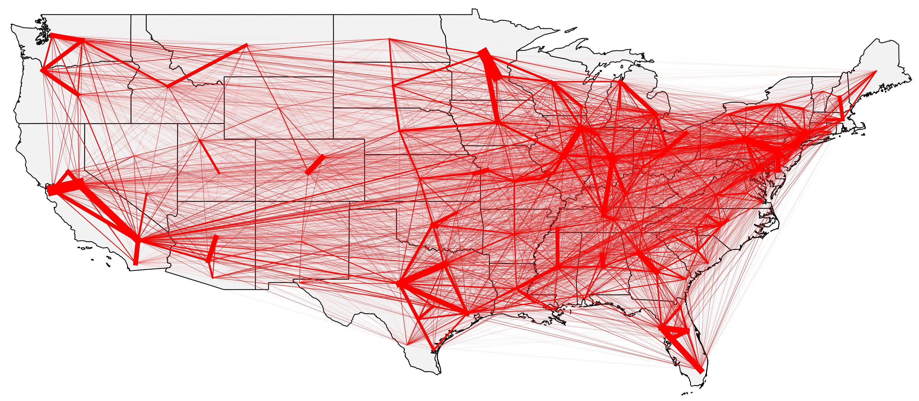
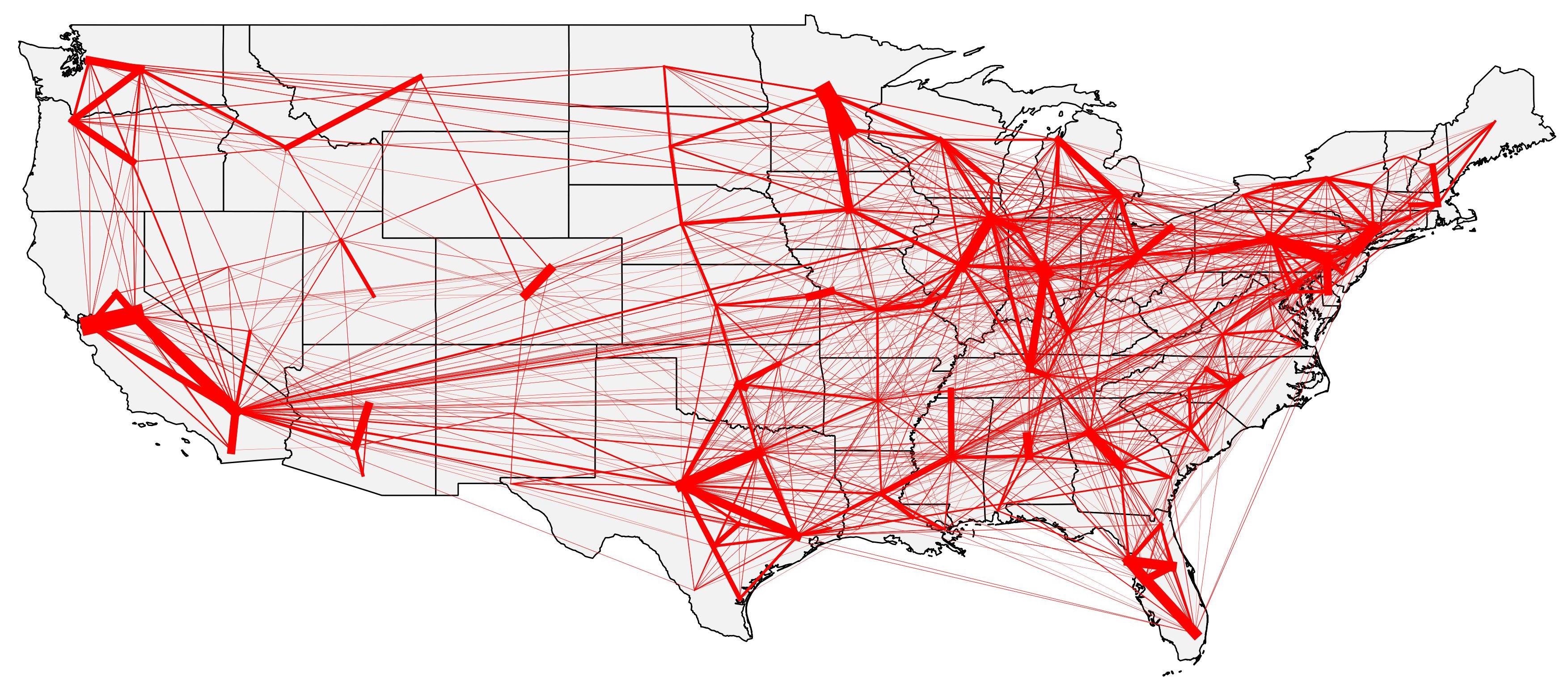
It looks terrible, right? Shouldn’t we remove the least representative connections? After much testing with several thresholds (60%, 75%, 85% and 95% of the biggest flows), I reached a map that is a lot better than the previous one by showing only the flows that sum up to 85% of the flows. The map is still a bit cluttered, but it is ok.
Discussing this issue with my wife (yes, she knows TransCad better than I do), she mentioned the existence of a tool called “Spider Desire Lines” (or something of that sort) in previous versions of TransCad. She could not really remember what it was and when it was dropped out of TransCad or if it was inside TransCad and not another software since it’s been over 15 years since she remembers using such a tool.
In a nutshell, spider lines would be the result of an All or Nothing assignment of the demand matrix into a minimal network connecting all the centroids, instead of just generating straight lines from all origins to all destinations. The idea was always very appealing to me, but I never had a good answer to the “minimal network” problem until a little while ago.
If you follow my blog, you already know that I have been working a lot with GIS and have been exploring new tools, especially within QGIS and GRASS, and part of this effort is studying GIS theory and classical algorithms applied to GIS analysis.
I will not bore you with a description of the many very interesting algorithms I found, but one algorithm seems to be incredibly useful in generating this “minimal network” I needed for the spider lines: Delaunay Triangles. According to Wikipedia, “a Delaunay triangulation for a set P of points in a plane is a triangulation DT(P) such that no point in P is inside the circumcircle of any triangle in DT(P). Delaunay triangulations maximize the minimum angle of all the angles of the triangles in the triangulation; they tend to avoid skinny triangles.”. It is a quite old algorithm dating from 1934, and it is widely used in the GIS community.
So I decided to do the following:
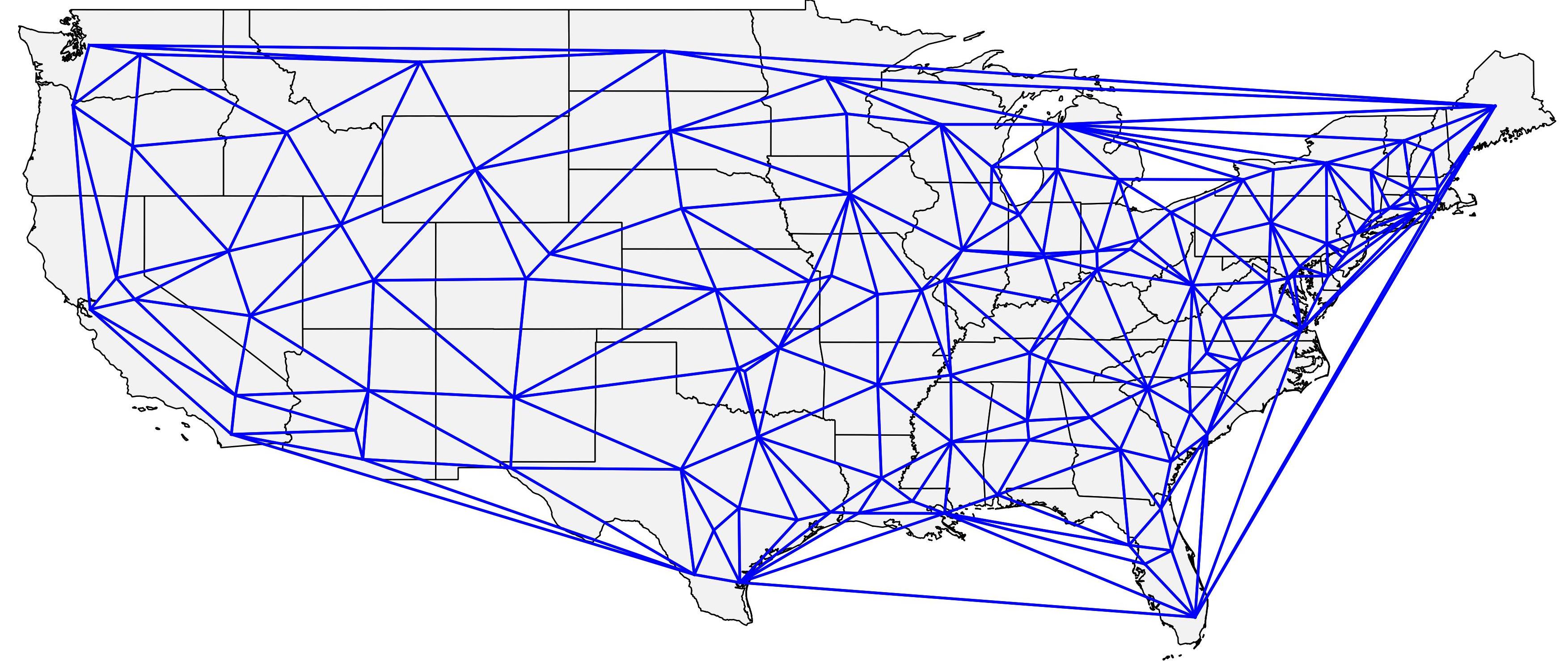
- Computed the Delaunay triangles for my FAF centroids
- Transform the edges of the triangles in a network
- Performed an AoN assignment using the network resulting from the 1st step
- Plot the assignment results as my spider lines result
This procedure has the advantage that it can be efficiently performed by using QGIS (Free!!) and the assignment library I published in this blog earlier, and it also does not require a lot of manual labor for its computation. I must say, however, that QGIS does not carry the information on the node IDs when you generate the Delaunay triangles, so on step number two, I had to export the triangles to a file in WKT format in order to identify the edges and tag (using vlookup in excel) the FAF centroid nodes that corresponded to each and every triangle vertex. It was more work than I had anticipated, but still not much.
The result of the first step is pretty interesting, as can be seen in the map below, is pretty reasonable as a “minimal network“, and it works well for both the East Coast, which has a much higher concentration of FAF zones, and for the Midwest, which has a much lower concentration of such zones. If anybody is interested in having the network, it can be downloaded HERE. The file is a *.shp that includes the nodes of origin and destination of each connection according to the FAF numbering system AND the final assignment results I present at the end of this post.
I might write some code to generate the Delaunay Triangles directly as a network identified by the node IDs in the future, but I thought of sharing the results for this experiment first.
Step number three was accomplished by using the library I posted HERE, and for this network, it was so fast that I thought it had not run at first…
The final result for the FAF truck data for 2007 was a much clearer map than the one computed using standard desire lines, as can be seen below.
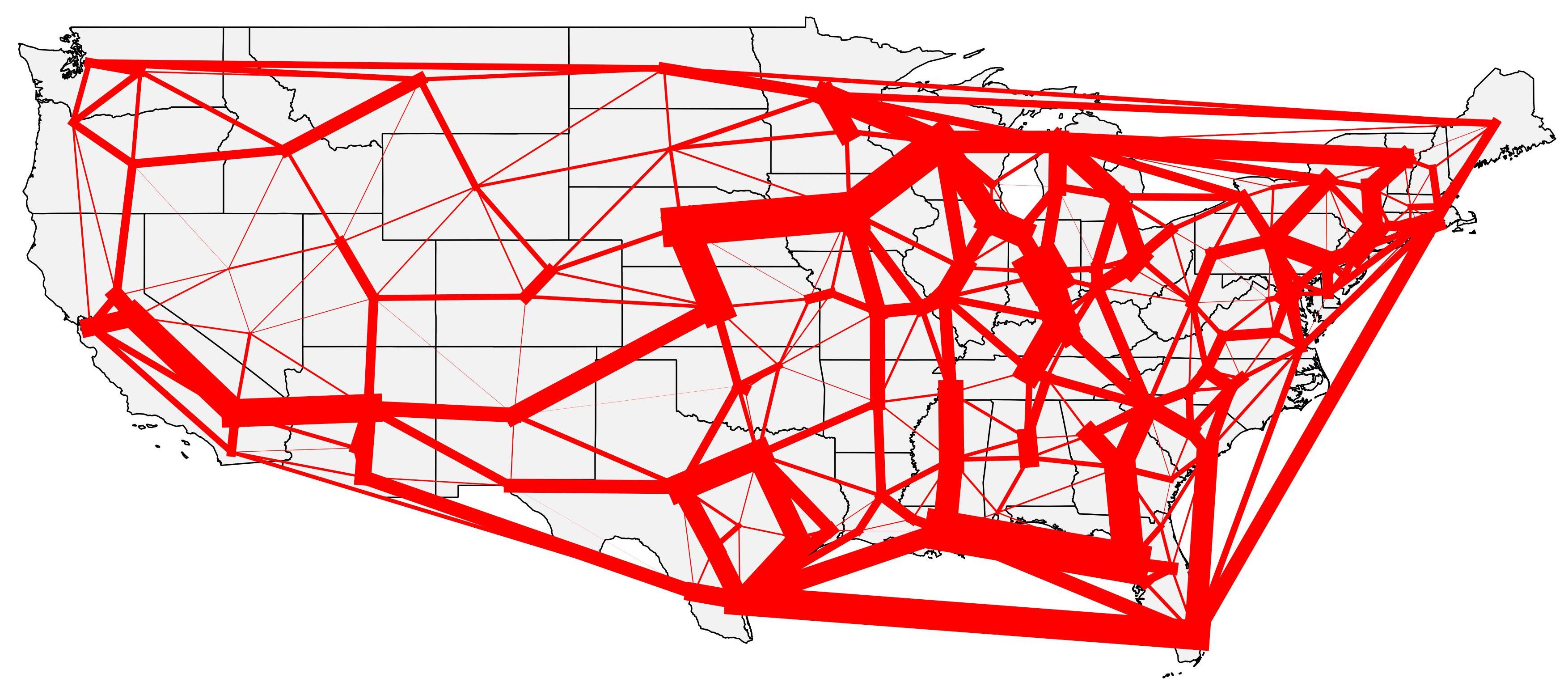
Additional to the fact that there is not that bunch of lines overlapping, it is also easier to see some aggregate movements between the US regions, for example, the movement between California and the Chicago region, and between the states in the South, or yet the movements between Chicago and the New York area.
It is true that we could just get the Interstate system network and perform an all or nothing assignment, but that is not possible in all cases (there isn’t always a network that you can use before you develop your own) and that bias the results towards the network that already exists, which is not a great idea when you want to get a feel of the demand only and not of the final result on the loaded network.