
Pedro Camargo, Ph.D.
Monday, February 12, 2018
Matrix API and multi-class assignment
Taking the new version of AequilibraE for a ride, my first application used a data source that is very familiar to me, the Freight Analysis Framework. It is a rich data source, yet fairly small due to its large zones, thus making for pretty quick tests (even on my 9yo laptop).
The first task was to import the FAF matrices into the AequilibraE format in a Python shell. And boy… That was easy and fast. This also prompted me to add this example to the wiki and to create a repository only for the API tests, where I will probably load tests in Jupyter notebook format only. This first test was generated in both formats, but I am likely to create new examples in only one format, but I still need to see what works better for the users.
For those interested in importing large numbers of matrices, I highly recommend taking a look at this notebook. The whole process involved generating a list of SCTG codes and names, which I am making available here. Also, if you can’t access the FAF data due to a US government shutdown, I will load the flow database, the user guide and the FAF 4 zoning here.
Importing all these matrices and saving to a network drive (over standard gigabit) took about 1/2 minute, and resulted in 22 matrices with 43 cores each, in a total of 125Mb. I did absolutely no effort to optimize the process and make it faster, and it is clear that such an effort was not indeed necessary.
Here comes the first nice new feature (from a non-programmer user perspective) , the visualizer:
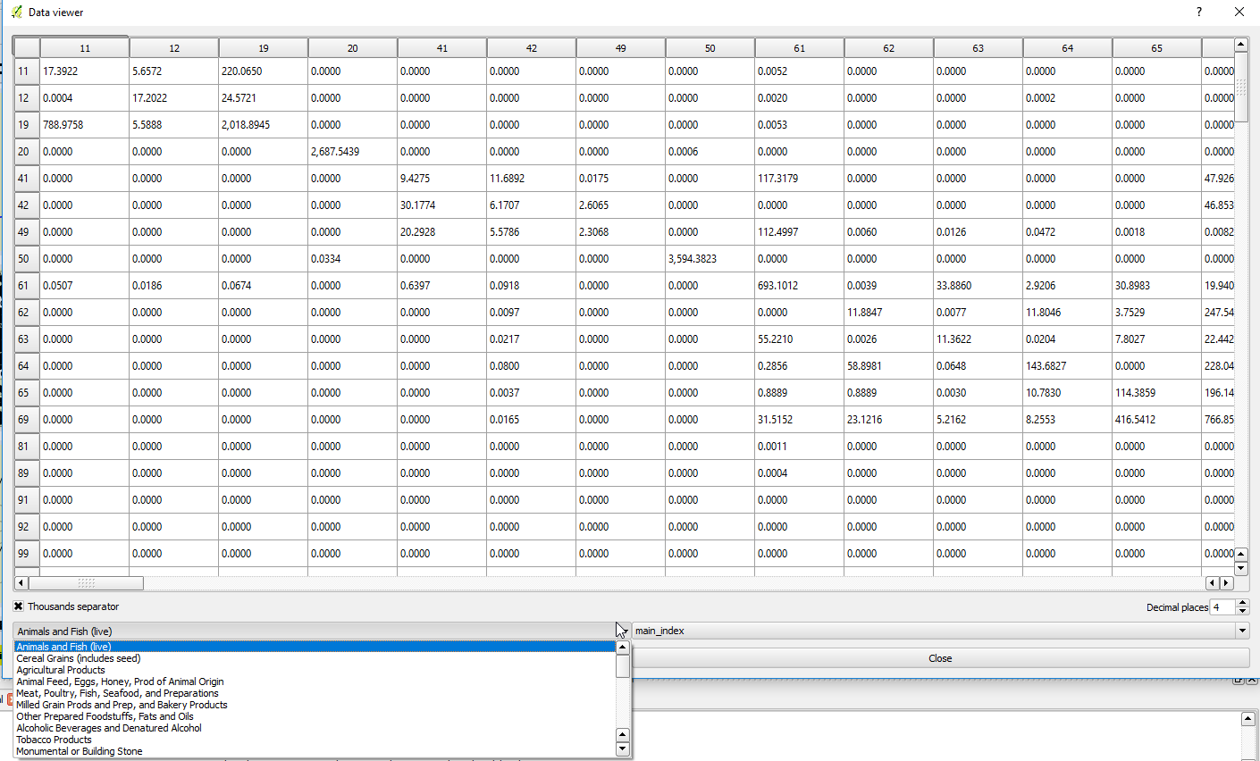
Loading the matrix takes a split second (too fast to measure), and allows the user to browse through the matrices in a very responsive way (again, even on my super old laptop). Tests with really large matrices (~10,000 zones) also showed no difference in performance when it came to visualizing inside QGIS. You can see that the matrix is full of zeros, as I chose to fill empty cells with zeros, but you can choose to fill them with empty (NumPy NaN) if you wish, which would result in blank cells in the visualizer and do not impact any algorithm involving matrices.
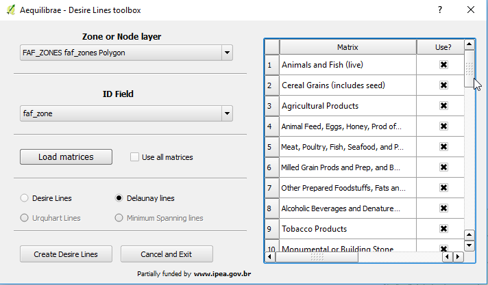
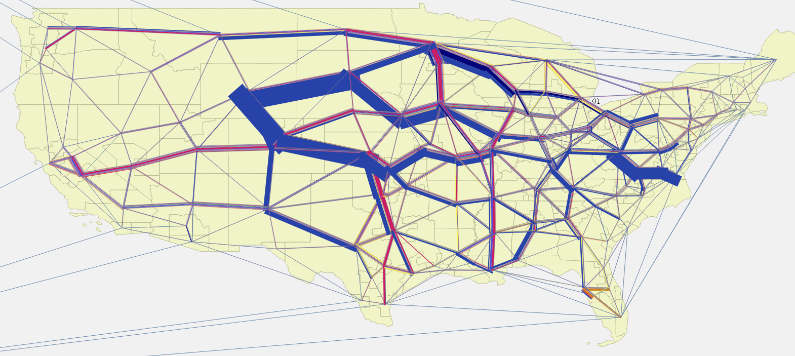
With the matrices at hand, it was time to take a look into a second nice feature introduced in AequilibraE 0.4: Multi-class assignment. As this feature permeated all procedures, including desire and Delaunay Lines, I decided to create a massive multi-class Delaunay Lines just to see what was possible.
First of all, having the matrices saved in AequilibraE format eliminates the most time-consuming step of the Delaunay Lines creation process on versions 0.3.X. The user can still choose to import matrices in the old way and not save the result of the import into*aem, but I would not recommend such practice. Hard drives are cheap and the data interface in QGIS is slow.
Upon choosing a matrix, the user does not see the list of matrices available, as the “use all matrices” option is checked, but they can choose to specify which matrices to use. For this test, I obviously used all matrices I had available.
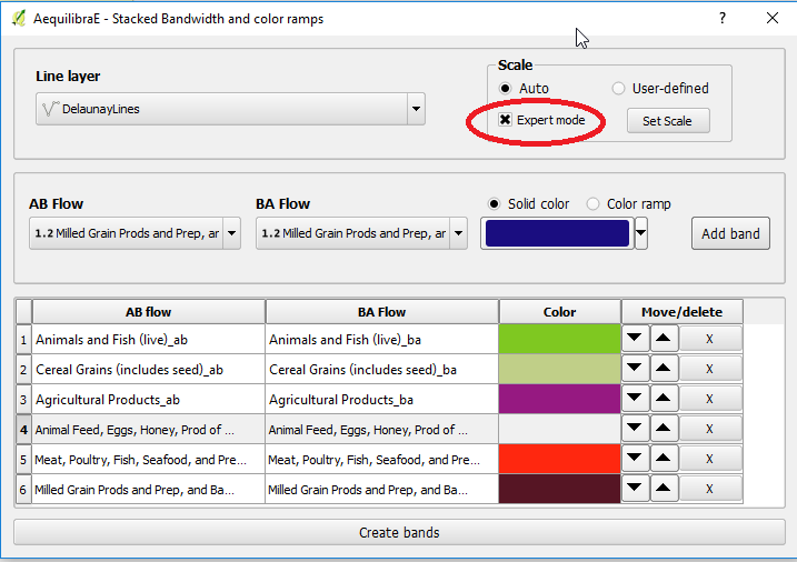
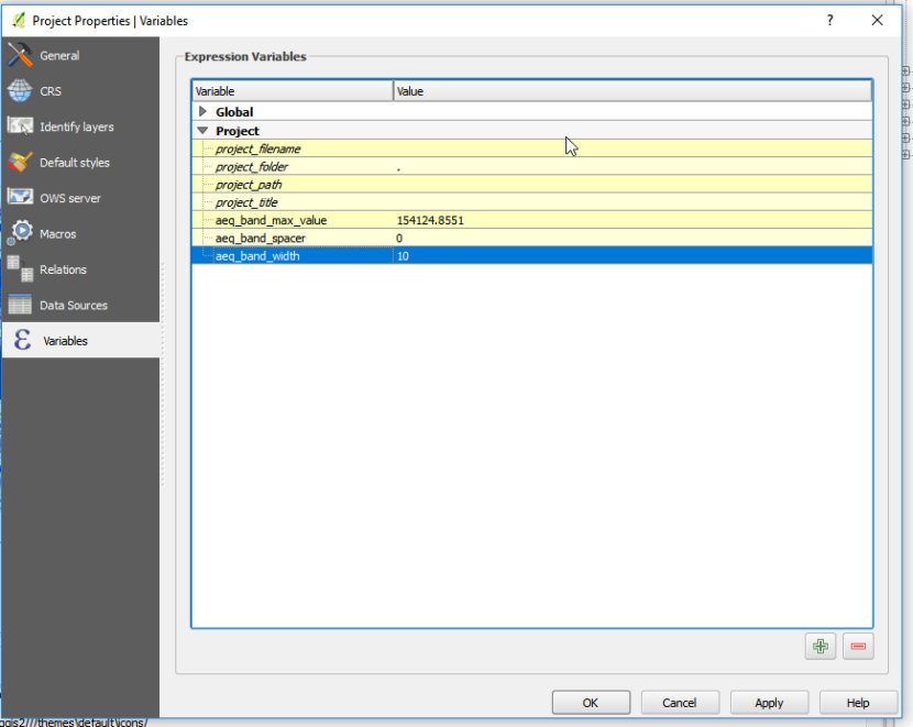
After running the algorithm, it was time to map the flows. For this task, It is worth noting the “expert mode” in the stacked bandwidth GUI, which sets all the scales as functions of three parameters saved as project variables in QGIS. To change these scales, the user can go to Project-Properties-Variables, and change these three parameters to fine-tune their map.
The result is quite pretty, even considering random colors and zero time formatting the map. It is also pretty clear that I need to add the capability of creating a legend for each stacked bandwidth, as there is no way to label each one of the symbols (or flows) for each line. Alternatively, I can replace the inner workings of the stacked bandwidths to generate rule-based symbols, which allow for proper labeling and tie well with the rest of the QGIS features. That will probably be the route I will take, but I need to rest a little before I re-factor a feature that works well already.
Happy modeling!