
Pedro Camargo, Ph.D.
Sunday, December 25, 2016
Stacked bandwidths
Since everybody in my office knows that I develop AequilibraE, every once in awhile somebody will ask me if I plan to implement a particular feature (most of which sound more like a mix of wishful thinking and feature request, of course). This dynamic has two nice components. The first one is that some pretty smart and knowledgeable people are also thinking about open source, and the second is that they give me some pretty nice ideas of new features, some of which I had never thought about.
Several of these ideas also have the brilliant advantage of being beautifully simple to implement, which makes it a no-brainer to put them in the priority list of features to develop. The first of these ideas was something I didn’t even know was possible in QGIS, and quite frankly had never used in TransCad, Emme, or any other package I used. It is what we call Stacked Bandwidths at the office.
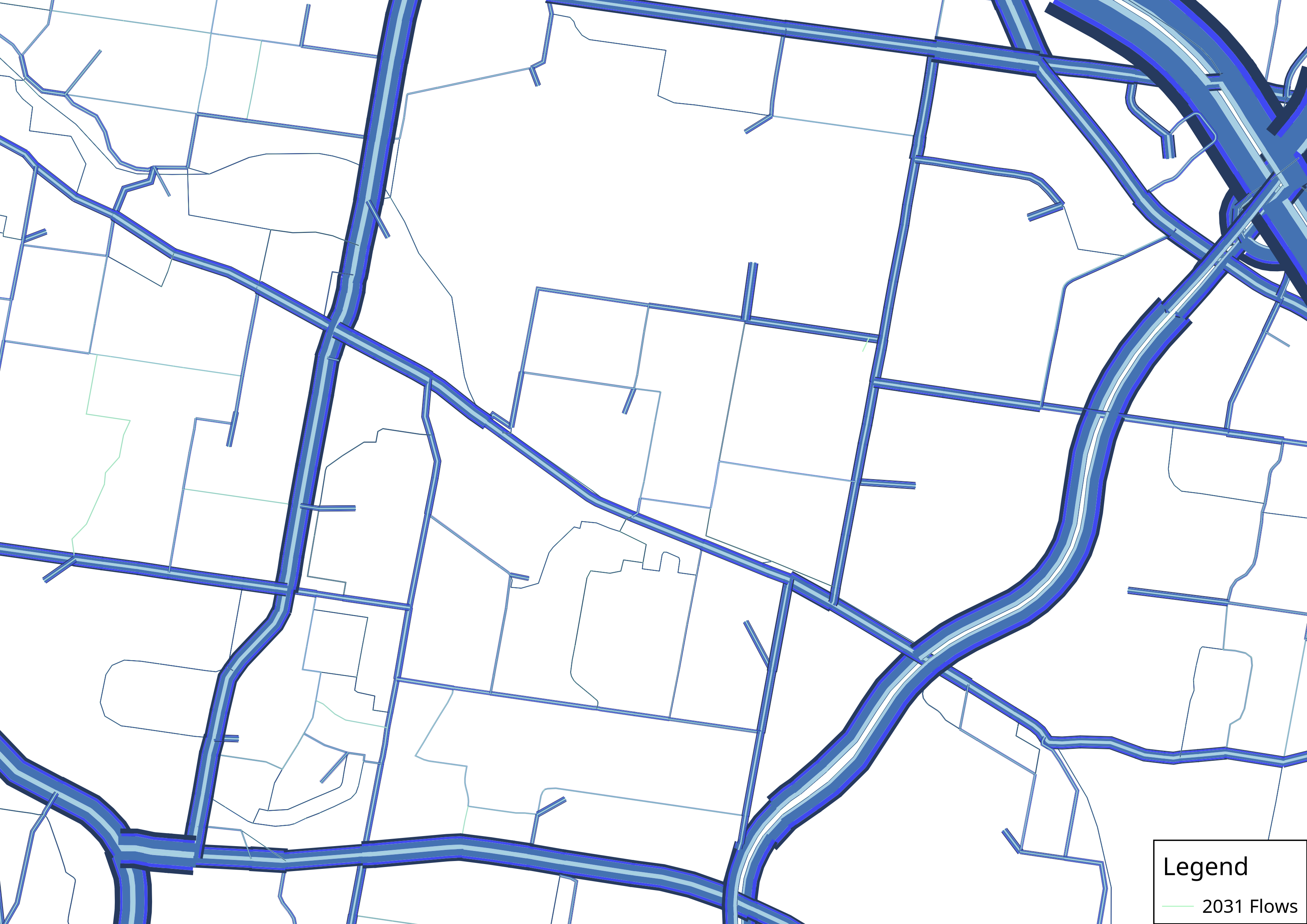
This tool consists basically of drawing data-driven bandwidths around links to depict say traffic flows, as shown in the map below.
The stacked part comes from the possibility of drawing multiple bandwidths side-by-side, allowing the user to make maps of daily flows in which each bandwidth represents the flow for one time period, or maps with traffic flows for a single period where each bandwidth represents one vehicle class or mode. Below there is one map designed as my first example.
After I finished this tool I got another feature request from a colleague for something that I should have thought about before but didn’t. Allowing to have the colors for each bandwidth as a function of some other characteristic of the links. The primary use for this tool in transportation modeling is clear, to make it possible to have total flow represented by the line width and the Volume/Capacity ratio represented by a color gradient. It has also many other applications, but the example below is for a very basic case of AM peak traffic in Brisbane, Australia.
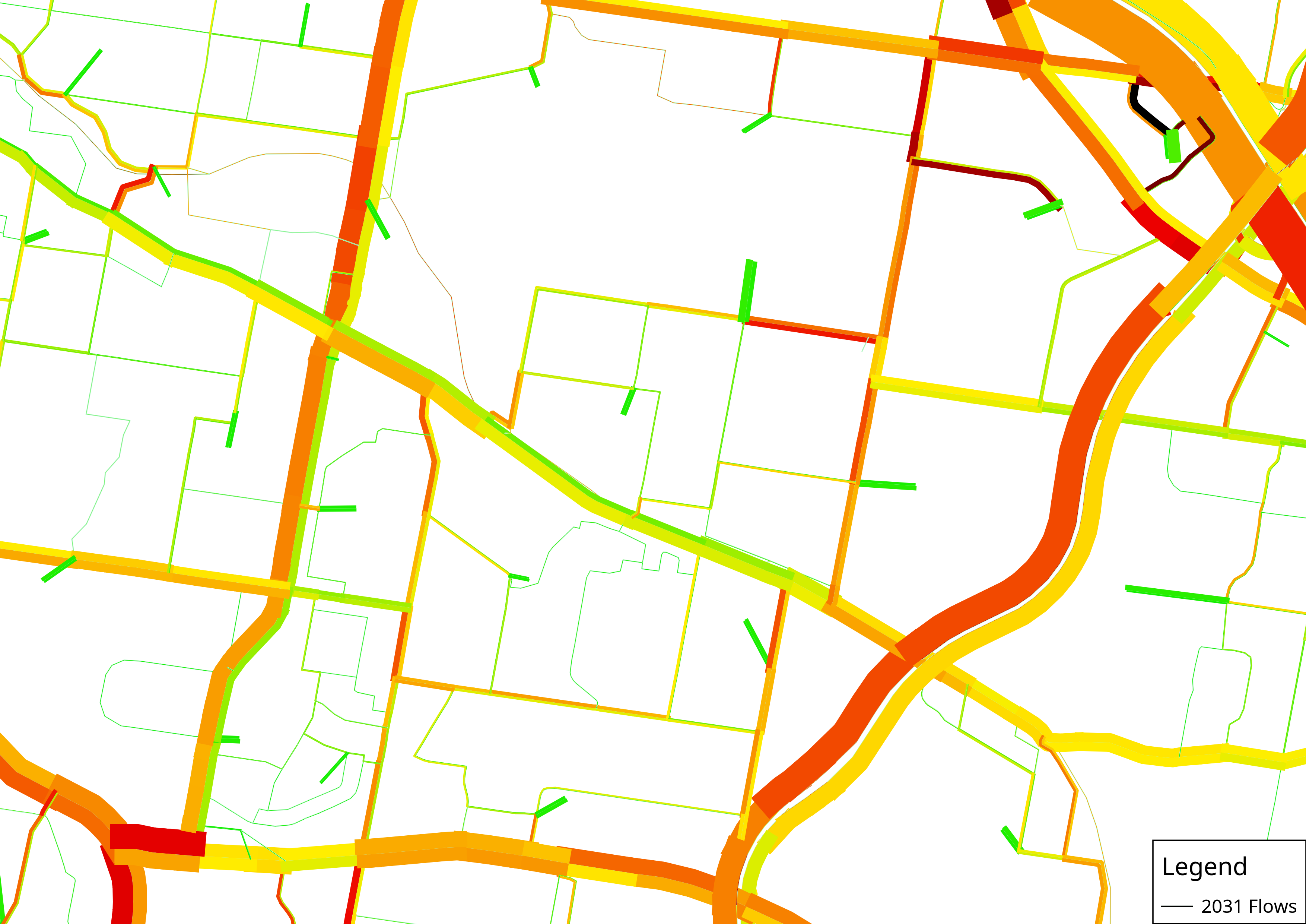
The only less-than-ideal thing in QGIS when it comes to color gradients is that there isn’t a good default color gradient for representing V/C ratios, so the user has to create their own. Since this might demand some fidgeting around with QGIS, I created a few color ramps and exported to a format you can import directly into your QGIS installation. You can download them HERE.
To import these color ramps (or to create your own) you can navigate to Setting – Style Manager… – Color Ramp. The plus sign allows you to create your own color ramp, and the little blue icon on the right-left of the GUI allows you to import these color ramps I created and to export those you created yourself to import in other machines.
If you are not quite sure how to operate AequilibraE after you download, you can watch the little tutorial video below to see how to use AequilibraE to create the maps I posted here and go own to create your own.
One last important note about color ramps: The definition of when colors transition and how you define your maximum and minimum are critical for the map result, so I recommend you try to edit the color ramps I am making available here to see exactly how they have been defined.
And if you enjoyed this, join the conversation about AequilibraE and make your own feature requests on aequilibrae@googlegroups.com
Kudos to Jordan Evans, Andrew O’Brien and Yung Yu Tsen for all the QGIS discussions and ideas.